Gemius analytical products
UX/Product Design and UX writing work for complex analytical products involving dashboards, tables, filters, metrics, reports, permissions, and data-heavy workflows.
Context
Problem
My role
Key challenges
- Helping users scan dense data without hiding important analytical detail
- Designing filters, metrics, and comparison states that reflect real product logic
- Writing copy that respects domain terminology while staying understandable
- Supporting both expert analytical workflows and less frequent users
- Coordinating design decisions with product, development, analysts, and business stakeholders
Process
Product contexts
AdReal
Advertising measurement product.
Rankings, metrics, dimensions, filters, report configuration, and advertising-focused analytical views.
Explorer
Media audience measurement product.
Audience analysis, demographic breakdowns, media measurement views, and market-specific reporting logic.
gemiusPrism
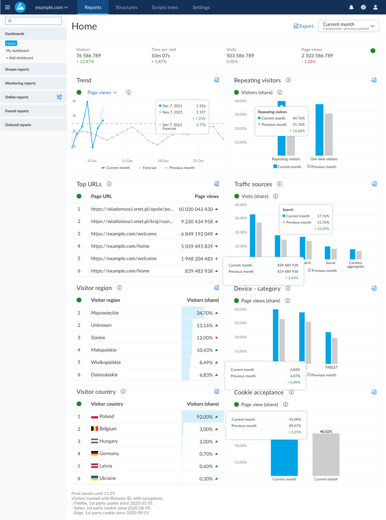
Web analytics product, comparable in category to Google Analytics.
Website performance dashboards, traffic sources, visitor behavior, comparison periods, exports, and overview-to-detail reporting.
Panelist surveys
Survey flows for panelists whose data supports products such as AdReal and Explorer.
Trust, clarity, consent, progress, mobile usability, and reducing friction in respondent-facing flows.
What I worked on
Analytical dashboards and reporting
Structuring dense reporting views so users can move from overview to detail: KPIs, charts, tables, rankings, exports, and repeated reporting patterns.
Filters, metrics, and configuration
Designing control logic for analytical products where one selection can affect available data, comparisons, labels, and interpretation.
Panelist and account flows
Designing simpler user-facing flows connected to the data ecosystem: surveys, onboarding, permissions, access, instructions, and status communication.
Product language
Writing interface copy, labels, tooltips, errors, onboarding messages, instructions, and documentation that help users understand complex product behavior.
Key design decisions
Dense dashboards can become a wall of numbers.
Group information into clear modules with visible hierarchy between KPIs, charts, tables, and supporting metadata.
This lets users scan first, then inspect details without losing orientation.
Analytical users need comparisons, not only current values.
Expose comparison states directly in charts, tables, deltas, and tooltips instead of hiding them in separate reports.
Change becomes easier to interpret when current and previous periods stay in the same visual context.
Product terminology has to be precise, but precision can make interfaces hard to read.
Use domain language where accuracy matters, supported by labels, hints, and documentation where the concept needs explanation.
The interface stays credible for experts while remaining usable for people who do not live inside the product every day.
Solution
Visual evidence
gemiusPrism: comparison states inside a dense dashboard
A web analytics view showing how charts, tables, deltas, and tooltips can work together to make changes easier to interpret.
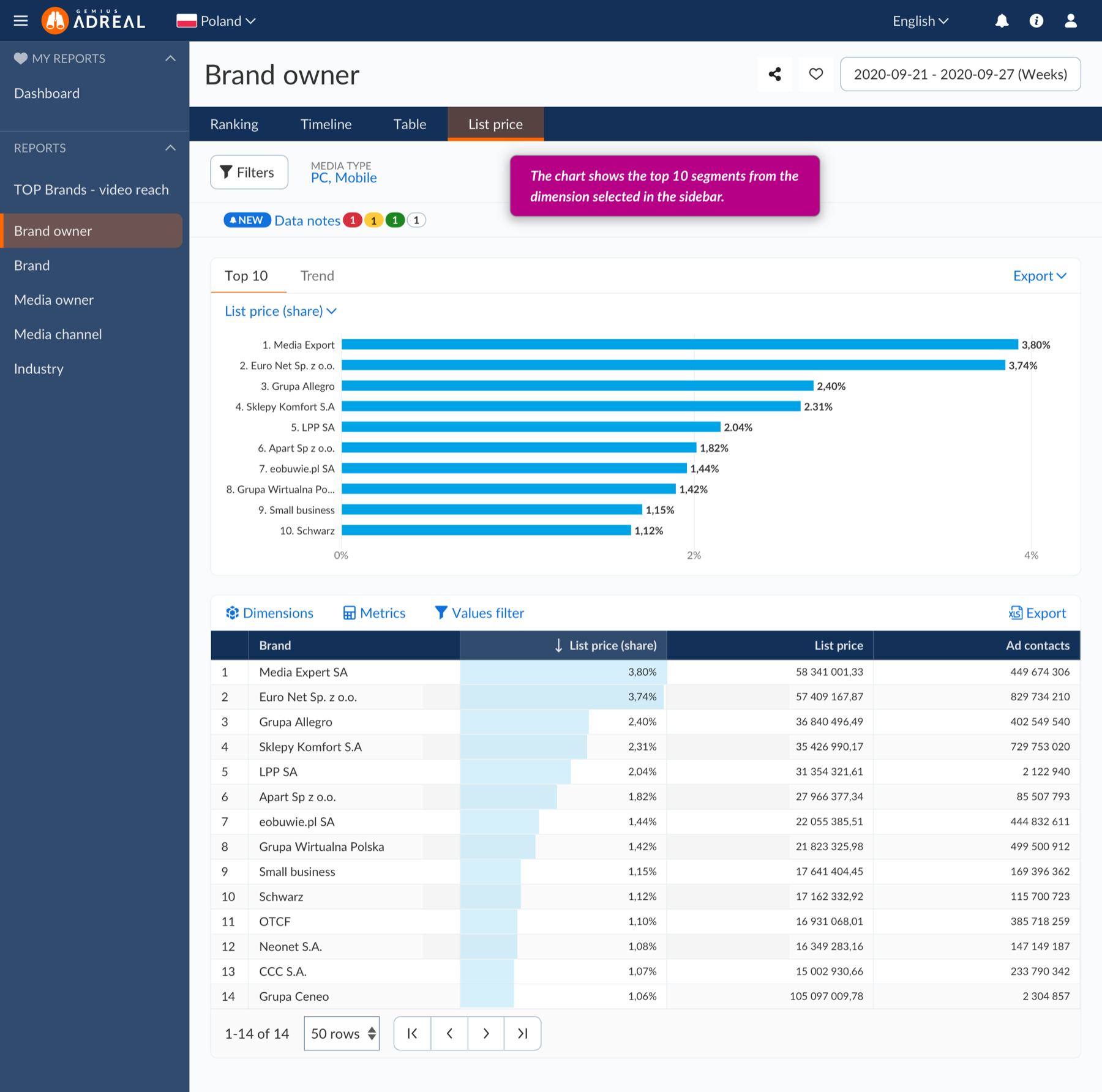
AdReal: ranking and table-based advertising analysis
A report view where rankings, dimensions, metrics, data notes, filters, and tables need to stay readable without hiding analytical control.
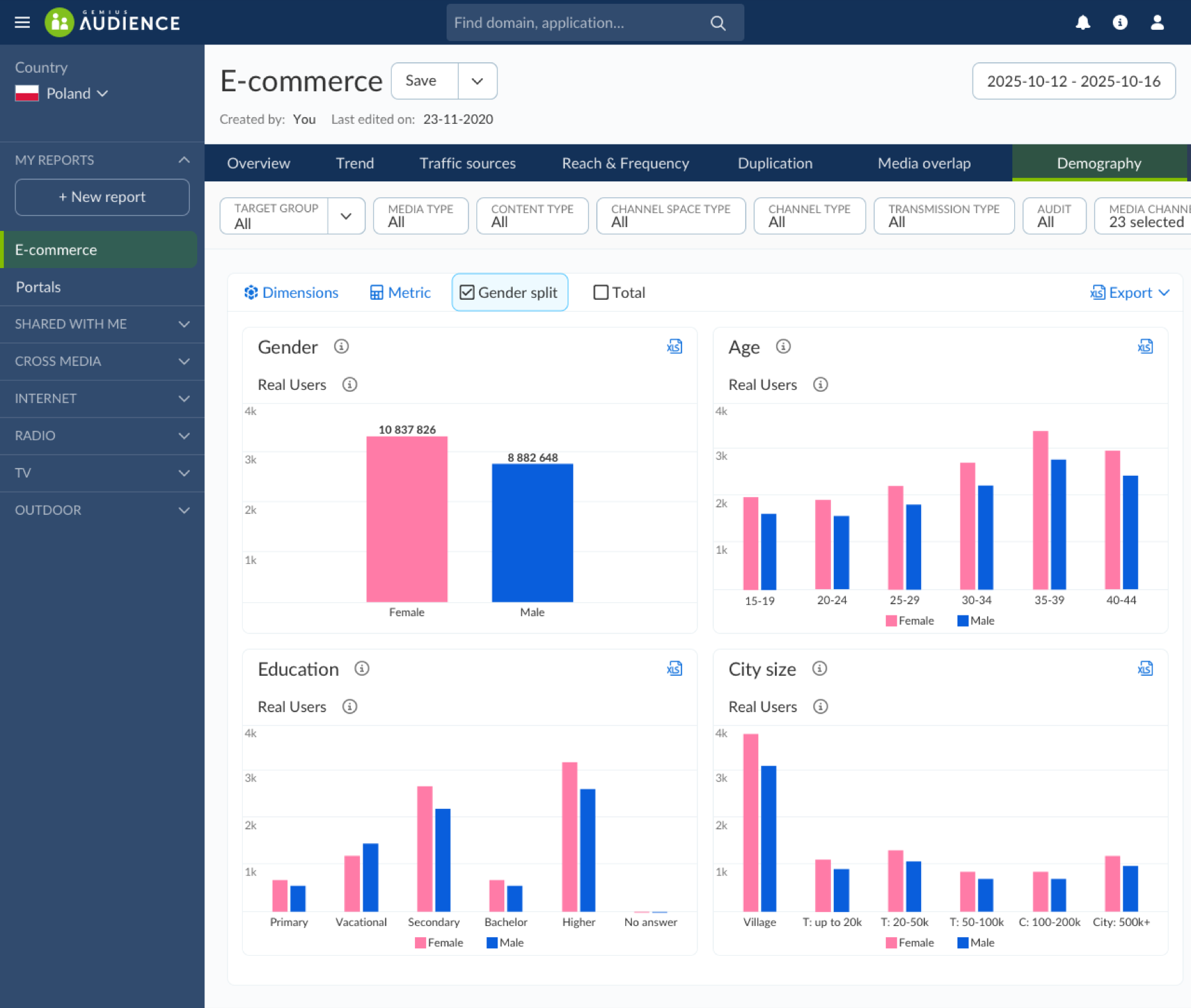
Explorer: audience measurement and demographic breakdowns
A media audience view showing how segmentation and demographic data can be exposed through clear controls and comparable chart modules.
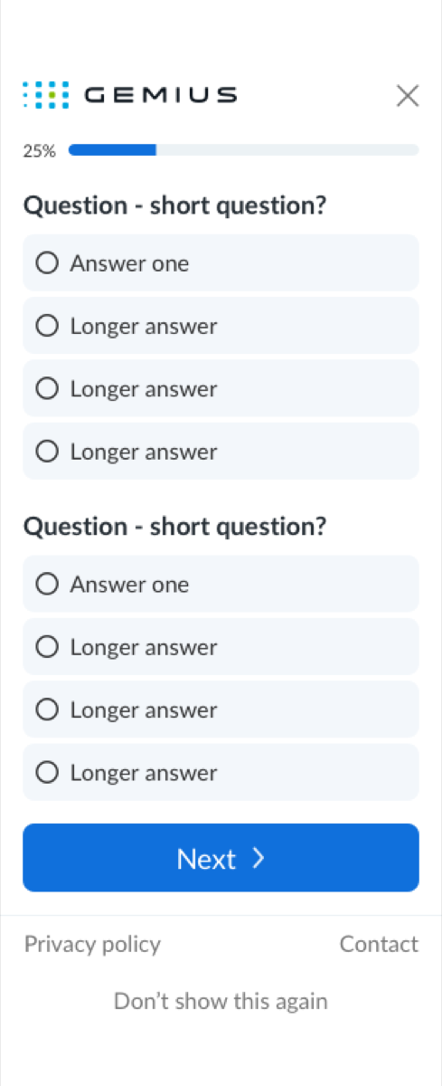
Panelist surveys: respondent-facing clarity
A simpler, mobile-first flow connected to the same data ecosystem, focused on trust, progress, and low-friction participation.
What this project demonstrates
- complex SaaS experience
- analytical product design
- data-heavy UX
- UX writing for complex flows
- documentation
- design system work
- collaboration with product and development teams
Reflection
Ask the assistant about this project
Hi, I'm Patrycja's AI portfolio assistant. I can help you explore her experience, projects, AI work, UX writing skills, and potential fit for your role or team. You can ask a specific question or paste a job description for a role-fit check.
Please do not paste confidential or sensitive personal information. This assistant sends your question to Google Gemini API free tier and answers from Patrycja's approved portfolio knowledge base. Some details may still need to be confirmed directly with her.